Apr 2 2007->Oct 31 2015
| < May 2014 > | |||||||
| Sun | Mon | Tue | Wed | Thu | Fri | Sat | |
| 1 | 2 | 3 | |||||
| 4 | 5 | 6 | 7 | 8 | 9 | 10 | |
| 11 | 12 | 13 | 14 | 15 | 16 | 17 | |
| 18 | 19 | 20 | 21 | 22 | 23 | 24 | |
| 25 | 26 | 27 | 28 | 29 | 30 | 31 | |
|
|
|||||||
| < June 2014 > | |||||||
| Sun | Mon | Tue | Wed | Thu | Fri | Sat | |
| 1 | 2 | 3 | 4 | 5 | 6 | 7 | |
| 8 | 9 | 10 | 11 | 12 | 13 | 14 | |
| 15 | 16 | 17 | 18 | 19 | 20 | 21 | |
| 22 | 23 | 24 | 25 | 26 | 27 | 28 | |
| 29 | 30 | ||||||
|
|
|||||||
Updated daily
Monday's quote
"Education is the only way to get off of this rock."
- Senior C. O. Blumus, 1641
Tuesday's quote
"Never pop the seal, unless you're willing to face the consequences."
- Sub Commander Fredricks, 1969
Wednesday's quote
"I fear what's in the box, not because it's wet, but because its clock is ticking."
- Sgt. Elers (Bomb squad), 2013
Thursday's quote
"Attack from up high, for it takes no effort to fall."
- Gorilla Warfare, 1970
| <|First <Previous Comic | Next Comic> Last|> |
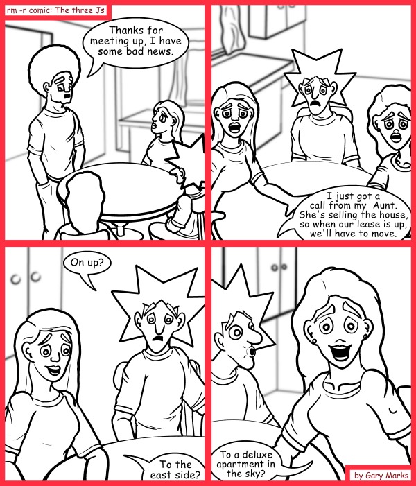
Selling out
2014-06-30

1026
|
Tweet
|
| <|First <Previous Comic | Next Comic> Last|> |
|
More Denver Comic Con 2014 Notes Gary Yup, this is the start of a move towards continuity. Hopefully, this will lead to blue prints of where they live, since their current rented house has only had a really rough mental outline in my head. Denver Comic Con 2014 panel notesWebcomics, a different perspectiveI really should have written down the names of everyone and the descriptions, because this data has been taken down... yay.How do you deal with criticism?
Plan your comic out. Plan it far ahead, but be willing to change it. Sometimes the characters don't end up where you planned for them to be, and that's ok, as long as you learn to adapt and change with it. Standard backgrounds are things many of the artists use. They are generic inside shots which are setup with an outside shot (called an establishing shot). Many sitcoms use this too, and it makes the development of backgrounds easier. It is extremely important to make a buffer for yourself. This is one that hits close to home. I've had a buffer a few times, and it's great. It allowed me to do much higher quality comics, because I wasn't butting against a deadline, but inevitably, I'd always run out of my buffer, so this is something I still need to work on. Two things that artists should always be looking at and working on are perspective and life drawing. There are a lot of perspective lines/tools out there for people to use. They should read up on it, and learn it. Life drawing is just something that will allow an artist to continue to grow their skill, and make their characters that much more believable. Backgrounds and locations are very important. They act like characters to you story, so you should really work on them. If you want to know what a cityscape looks like from a specific angle, try something like SketchUp which is a free plug in for google earth. What do you do if you find your comics are too wordy?
Only four more panels to type up notes for, and a couple hundred costume photos to whittle down. If anyone knows the names of the people who were in that talk, let me know, and I'll update this. |
|
Current tweets Tweets by @rmrcomic |
comments powered by Disqus
|
|