Apr 2 2007->Oct 31 2015
| < July 2012 > | |||||||
| Sun | Mon | Tue | Wed | Thu | Fri | Sat | |
| 1 | 2 | 3 | 4 | 5 | 6 | 7 | |
| 8 | 9 | 10 | 11 | 12 | 13 | 14 | |
| 15 | 16 | 17 | 18 | 19 | 20 | 21 | |
| 22 | 23 | 24 | 25 | 26 | 27 | 28 | |
| 29 | 30 | 31 | |||||
|
|
|||||||
| < August 2012 > | |||||||
| Sun | Mon | Tue | Wed | Thu | Fri | Sat | |
| 1 | 2 | 3 | 4 | ||||
| 5 | 6 | 7 | 8 | 9 | 10 | 11 | |
| 12 | 13 | 14 | 15 | 16 | 17 | 18 | |
| 19 | 20 | 21 | 22 | 23 | 24 | 25 | |
| 26 | 27 | 28 | 29 | 30 | 31 | ||
|
|
|||||||
Updated daily
Monday's quote
"Listen to the paranoia, or else they'll get you."
- Dr Samuel Mazna (Psychiatrist), 1952
Tuesday's quote
"I get moved around more than a shuffle board disc on a seniors' cruise."
- Peggy Subterfuug, 1973
| <|First <Previous Comic | Next Comic> Last|> |
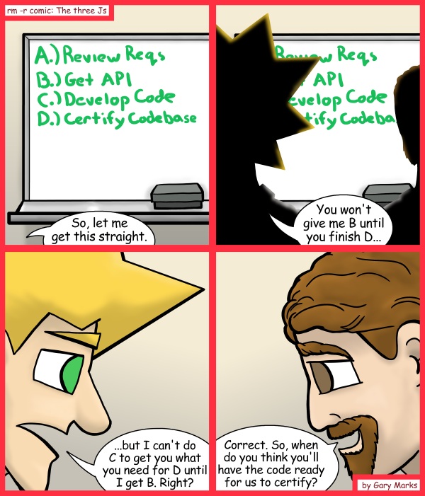
Certifiable
2012-08-06
740
|
Tweet
|
| <|First <Previous Comic | Next Comic> Last|> |
|
Cool art Gary A while back, I went to Denver Comic Con. When I was there, I bought a page that Jazel Riley drew. I don't often buy pages that people do, but sometimes, you just run across one that strikes you. That's what this one did to me. Here's the page I bought. 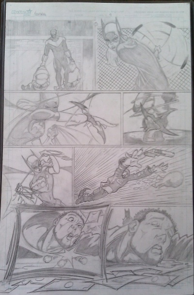 The page is fairly basic, but it still has some playfulness in it, as seen by how he played with the panels. This is something I like to see, but the layout wasn't the reason I really loved the piece. What I really liked was the forms and the motion in them. 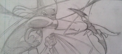 Take this hand of Batgirl, it's not 100% anatomically correct, but the changes made to it really give it a lot of motion. Smoothing out the hand and having the arm cross over the bottom of Batgirl's face make so I can almost image the full motion of the arm. Also, you can see the other hand in the image, the one holding the rope which is way less stylized and more anatomically correct, showing he really knows his structure, and how to play with them, keeping them looking real while adding adjustments to make it come alive. 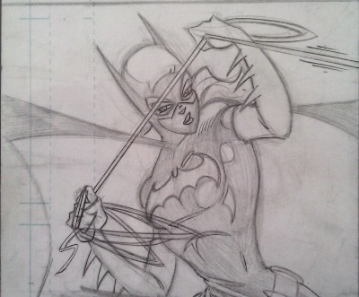 Then there's this frame, and even though I can't see much of the legs, I see enough to see the right leg forward and the left leg back, pulling. Again the motion is great, and the cape emphasizes it even more. This one also plays with the hands a little, making them more dynamic and sharp, pulling us into the action. 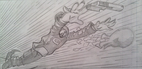 Next we move on to this frame, and, from experience, doing foreshortening on hands and arms like that is not easy. At least for me it isn't. It ends up being hard for me to keep the shape looking long enough while forshortening and altering the angle to be more forward, but he pulled it off, so I respect that a lot. 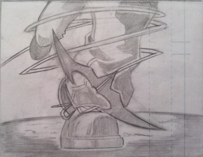 Then this one I just like how he handles the cord attached to the batterang, I actually like that in all the frames. 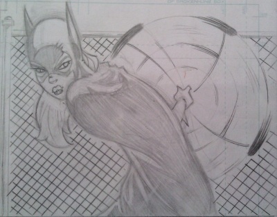 In this one, it's again the motion in the frame. Here we have the spinning of a bola behind the calmness of Batgirl. It's also a natural position of a person turning, ready for what's coming behind them. I really like this piece, and I recommend you all check out his work. On his Deviant Art page. On a second subject, I like how color on this comic turned out. I went to a more subtle shading and used the shading and shadows more like sculpting than cartooning. With it this way, I think the line weight still shows through really well, so maybe this is the route I'll go with coloring in the future. We'll see. Also, hopefully, I'll soon be able to tell you all about a side project I've been doing art for in my little free time. |
|
Current tweets Tweets by @rmrcomic |
comments powered by Disqus
|
|